Understanding the Power of Visual Branding
In today's fast-paced and visually driven world, strong branding is critical for startups trying to stand out. Visual branding - the colors, fonts, logos, and imagery you use - is often the first impression your audience gets of your business. It's the way your startup communicates its personality and values instantly.
Startups that invest in crafting a cohesive and thoughtful visual identity can create emotional connections that go beyond features or price. It's these emotional ties that encourage customers to choose you repeatedly and share your brand with others.
Why Visual Branding Matters for Startups
- Creates instant recognition and recall.
- Communicates your startup's personality without words.
- Builds trust and professional image.
- Differentiates your brand from competitors.
- Supports marketing efforts with consistent visuals.
Choosing a Distinctive Color Palette
Colors are a powerful language in branding because they evoke specific emotions and associations. Selecting the right color palette that matches your startup's values and audience preferences helps create an immediate impression that resonates.
Limiting your palette to a primary color plus two or three complementary shades keeps your branding visually cohesive and professional. Consistent use of these colors across all materials-from your website to social media-reinforces brand recognition and creates a unified look.
Tips for Effective Color Use
- Choose colors aligned with your brand values and target market.
- Test your palette for accessibility and contrast.
- Use bright colors sparingly to draw attention to key elements.
- Maintain color consistency across all platforms.
- Adapt your palette thoughtfully for different marketing materials.
Selecting Fonts That Speak Your Brand's Voice
Typography plays a critical role in how your brand's personality is perceived. The fonts you choose communicate tone and mood; they can make your startup appear modern, trustworthy, playful, or sophisticated. This “voice” helps customers connect emotionally with your message.
Whatever fonts you select, readability is paramount. Your typography should be legible on all devices and sizes to ensure your audience can easily engage with your content. Pairing style with function strengthens your brand presence.
Font Selection Best Practices
- Limit font choices to two or three families for clarity.
- Match font style to your startup's personality and industry.
- Use contrasting font weights and sizes for emphasis.
- Ensure accessibility with clear letterforms and spacing.
- Test fonts across platforms before finalizing.
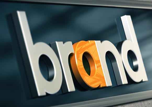
Designing a Logo That Embodies Your Brand
Your logo is often the most visible element of your branding and the central symbol customers associate with your startup. A strong logo is simple, memorable, and meaningful, capturing your brand essence in a visual mark.
The logo's style should align with your brand's personality. For example, a tech startup might opt for a sleek, minimalist design, while a creative agency could choose a more expressive and colorful logo. A well-designed logo builds instant recognition and trust.
Logo Design Guidelines
- Keep designs simple and versatile.
- Reflect your brand's core values and tone visually.
- Test logo appearance at different sizes and formats.
- Use color thoughtfully to complement your palette.
- Seek professional input or feedback to refine concepts.
Using Consistent Imagery and Visual Elements
Imagery, icons, and graphic elements contribute significantly to your brand's visual storytelling. Consistent style in photos and illustrations strengthens brand personality and helps communicate your message clearly.
Icons and other design elements should also support your brand's tone. A fun startup might use playful and colorful icons, while a finance startup may choose sleek, minimalist graphics to reinforce professionalism.
Visual Element Tips
- Choose imagery that reflects your brand values and audience.
- Maintain consistent styles (color, tone, filter) for photos.
- Use icons that support your message without clutter.
- Incorporate graphic elements that enhance readability and interest.
- Adapt visuals for each platform but keep the core style.
Building Brand Consistency for Long-Term Recognition
Consistency is the key to making your branding stick in the minds of customers. Using your visual elements in a uniform way across all touchpoints builds familiarity and trust. When customers recognize your colors, fonts, and logos repeatedly, they form a stronger connection.
As your startup grows, revisit and update your visual branding thoughtfully to keep it fresh while preserving core elements. A consistent brand presence helps you stand out in competitive markets and fosters long-term loyalty.
Maintaining Visual Brand Consistency
- Develop a comprehensive brand style guide.
- Educate team members and partners on visual standards.
- Review marketing materials for brand compliance.
- Adapt your brand visuals carefully over time.
- Use templates to speed up consistent content creation.
Conclusion: Invest in Visual Branding to Make Your Startup Memorable
For startups, creating visual branding that sticks is a powerful way to build recognition, trust, and emotional connections with your audience. Thoughtful choices in color, typography, logos, and imagery combined with consistent application help your brand stand out and resonate.
Ultimately, investing in a cohesive visual style is investing in your startup's long-term success. Make your branding stick by designing with intention and authenticity - your audience will notice and remember.